
- 2017 Jun 08
- Data Analysis
- #python, #Taxi, #Dask
The NYC Taxi and Limousine Commission (TLC) has publicly released a dataset of taxi trips from January 2009 - June 2016 with GPS coordinates for starting and endpoints. Chris Whong originally sent a FOIA request to the TLC, getting them to release the data, and has produced a famous visualization, NYC Taxis: A Day in the Life. Mark Litwintschik benchmarked various relational database and big data technologies using this dataset given its moderate 400GB size. And notably, Todd W. Schneider produced some really nice summaries of the dataset, some of which are similar to work I show here. I actually was not aware of Todd's work on this topic until after this post was written, so although there is a fair bit of overlap, this post and the graphics in it are original.
I downloaded the data files from TLC website, and (very painfully) using Python, Dask, and Spark, have produced a cleaned dataset in Parquet format, which I make this available for AWS users at the end of this post.
So I was curious, where do taxis pick up passengers, or more precisely, what does the distribution of taxi pickup locations look like? With 1.3 billion taxi pickups, plotting the distribution in a way that does not wash out detail is very challenging. Scatter plots are useless due to overplotting, and 2D histograms are a form of kernel density estimation that necessarily blur or pixelate a lot of the details. Additionally, with the full dataset, the pickup locations alone total 21GB, which is more than the memory of my 16GB laptop. Out of core tools can solve that technical problem easily (and subsampling is easier than that), but what about the visual problem? Human eyes are incapable of absorbing 21GB of information in a plot.
The solution to this comes from an interesting library called Datashader. It dynamically generates generate a 2D Histogram at the resolution of your display (or a specified canvas). Each pixel on the display corresponds to certain histogram boundaries in the data. The library counts the number of data points that fall within those boundaries for each pixel, and this number is used to color the intensity of the pixel. Leveraging Dask, the creation of the histogram can scale to terabytes of data, and be spread across a cluster. Leveraging Bokeh, the final plot can be zoomed and panned. Using techniques from high dynamic range photography, intensity ranges are mapped so that maximum dynamic contrast is present at any zoom level, and in any given viewport.
Taxi Pickup Locations
This is what the map of taxi pickup locations (1.3 billion points) looks like over Manhattan, plotted using the Viridis perceptually uniform colormap.
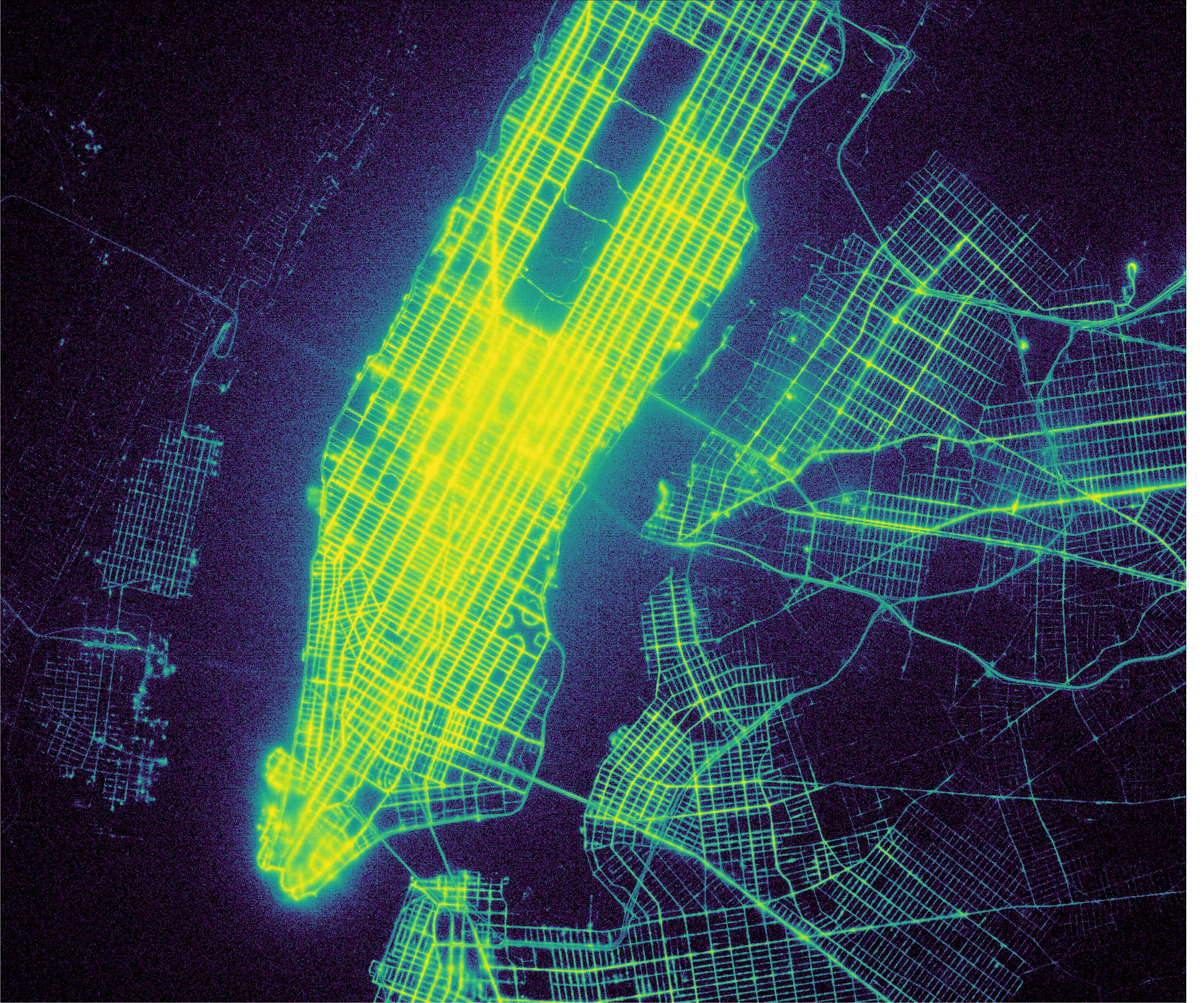 Figure 1: NYC Taxi pickups map for Manhattan Click for full resolution
The first thing I notice is how clearly I can see the street patterns. In parts of Brooklyn and Queens, the street pattern is sharp. In Manhattan, the pattern is `fuzzier', especially near the southern tip of Manhattan and in Midtown south of Central Park. There are an awful lot of pickups that, according to GPS coordinates, fall over the Hudson or East rivers, and quite a few pickups that fall in the portion of Central Park where there are no roads. Obviously, not a lot of taxi trips are starting in the rivers surrounding Manhattan, but what this plot shows is instead how important GPS error is. The fuzziness arises from tall buildings which make it quite difficult to get a good GPS fix, and the taller the buildings, the fuzzier the streets look. More broadly, the Midtown area south of Central Park is very bright, indicating a lot of taxi trips start there.
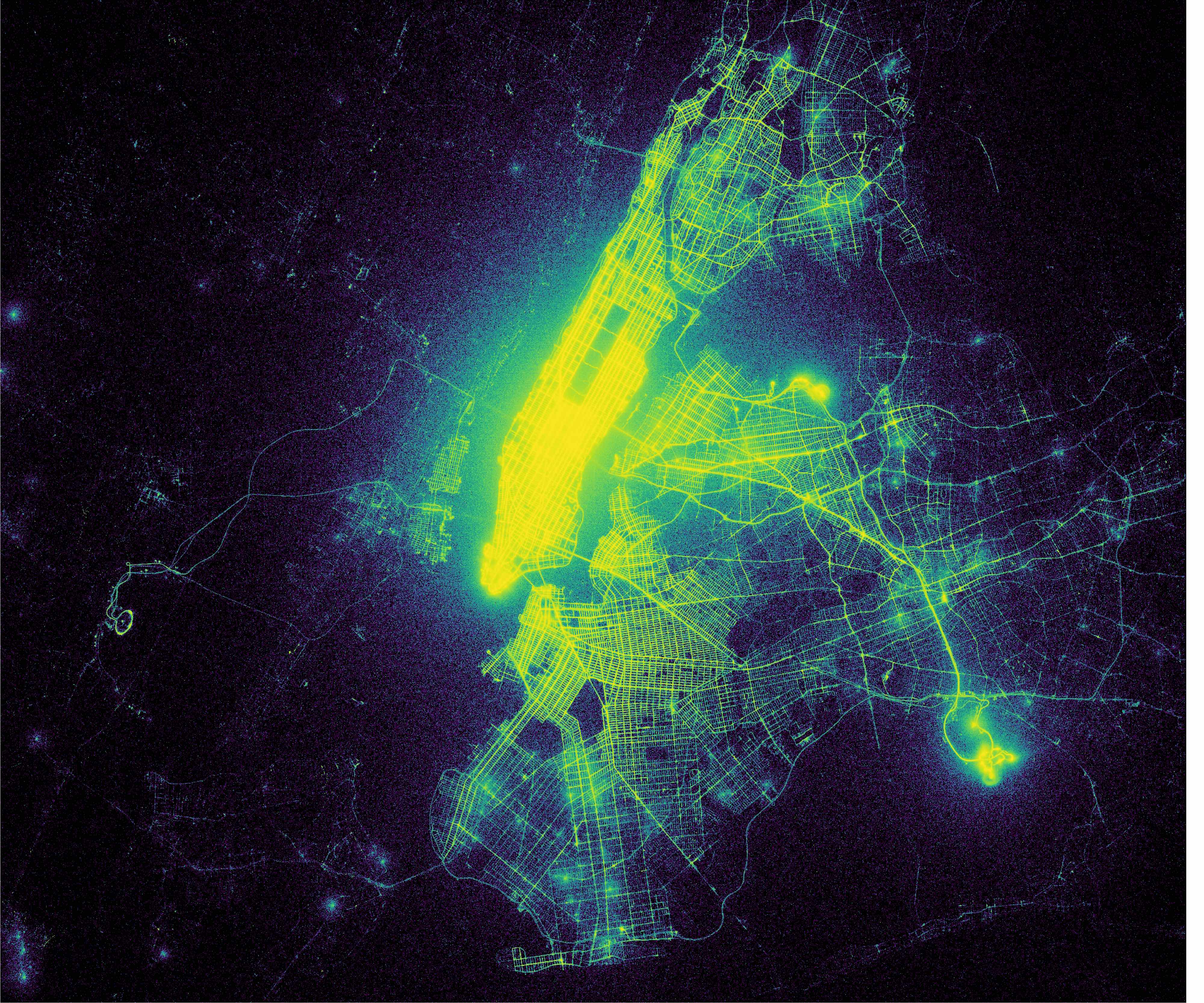 Figure 2: Taxi pickups map for NYC Metro Area Click for full resolution
The second image is also taxi pickups, but on a much wider scale. Zoomed out, most of Manhattan lights up like a beacon, indicating far more pickups in Manhattan than the surrounding area. But the airports, JFK and La Guardia in particular, also light up, showing nearly as much visual intensity (trips per unit area starting there) as Midtown.
Taxi Dropoff Locations
Now let's examine the dropoff locations using the Inferno colormap.
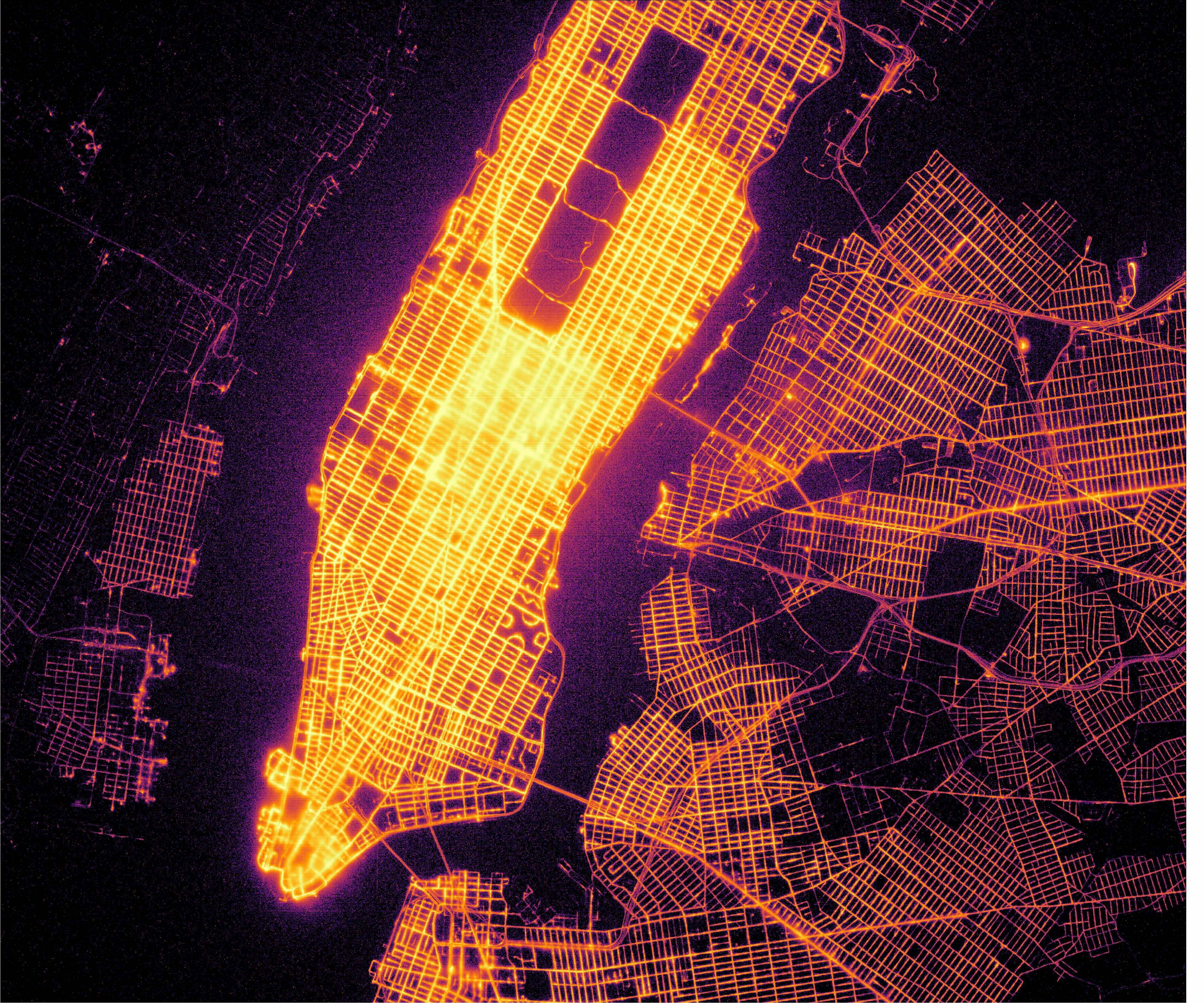 Figure 3: NYC Taxi dropoffs map for Manhattan Click for full resolution
At first glance, the dropoff locations look a lot like the pickup locations within Manhattan. The same regions, Midtown south of Central Park, and the southern tip of Manhattan show the brightest (and fuzziest) streets.
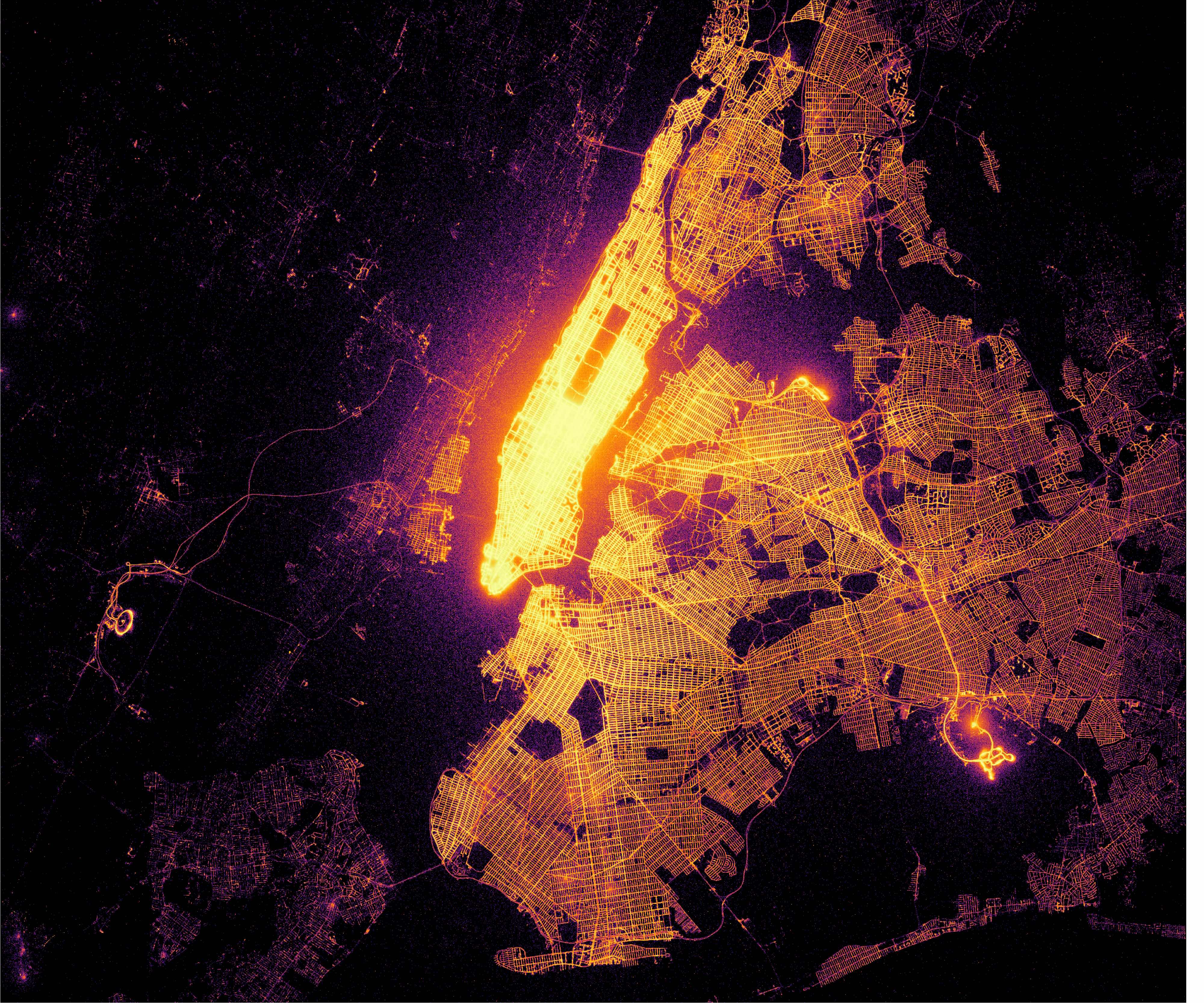 Figure 4: Taxi dropoffs map for NYC Metro Area Click for full resolution
Zooming out to the broader metro area, the streets in Brooklyn and Queens are much sharper and brighter, indicating there are a lot more dropoffs in the outer boroughs than pickups, and indicating the GPS error in these regions tends to be lower, presumably due to fewer tall buildings. In fact, in some places it looks good enough to use as a street map, indicating a relatively even distribution of taxi dropoffs in Brooklyn and Queens. This is quite distinct from the pickups map, indicating that there are relatively few pickups in the outer boroughs, but a lot of dropoffs there. Many people take taxis from Manhattan to the outer boroughs, but a lot fewer take taxis from the outer boroughs into Manhattan.
Taxi Pickup and Dropoff Locations
The last two plots compare pickups and dropoffs on a pixel by pixel basis. Wherever pickups are higher than dropoffs, the pixel is shaded with the Viridis green and yellow colormap. Wherever dropoffs are higher than pickups, the pixel is shaded with the purple and orange Inferno colormap.
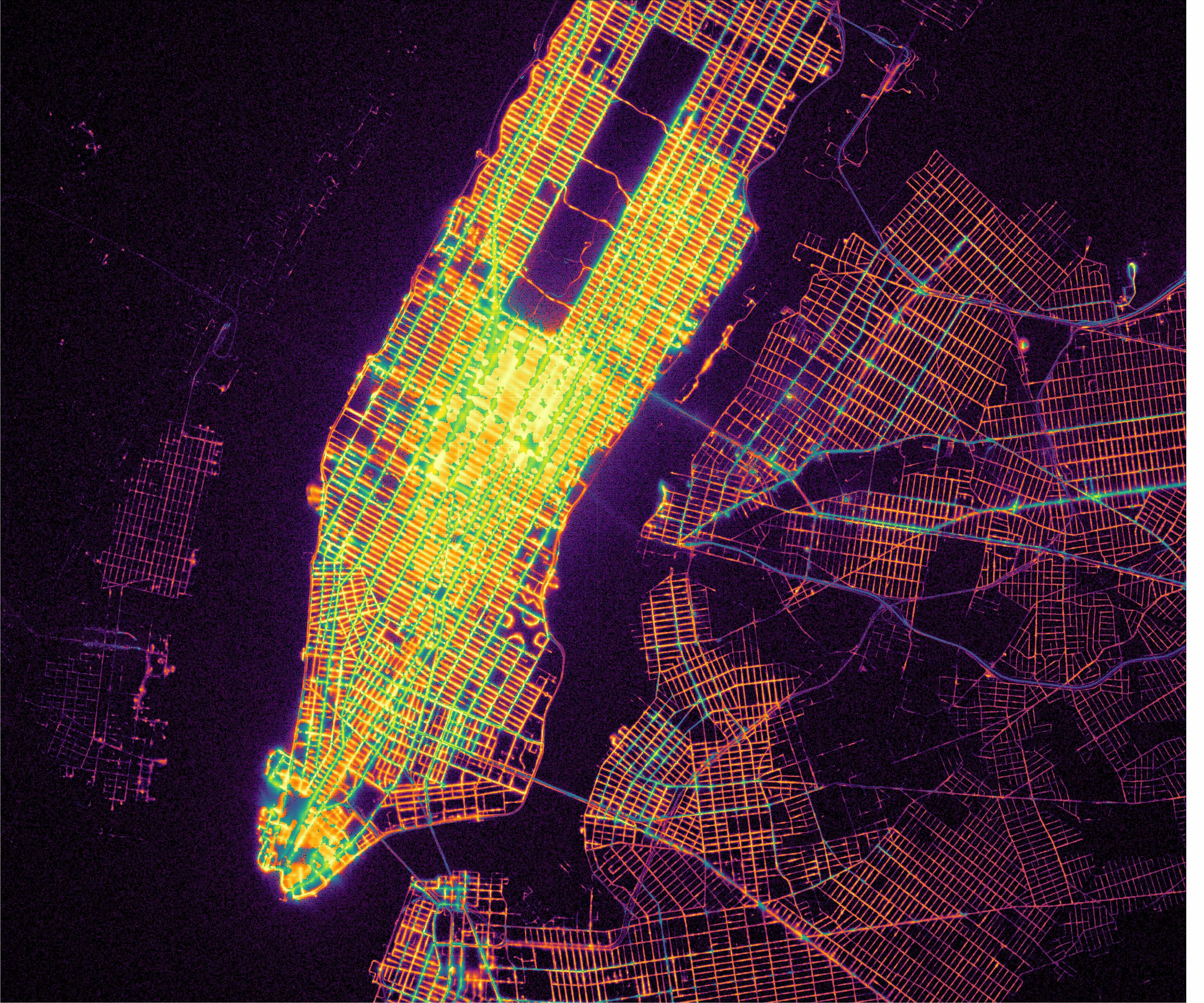 Figure 5: Pickups (Yellow-Green) and Dropoffs (Orange) for Manhattan Click for full resolution
In Manhattan, the Avenues (North-South streets) are lined with green, indicating more pickups than dropoffs. The cross streets (East-West) are orange, indicating more dropoffs. Practically, if I want to catch a taxi, it is probably easier to walk to the nearest avenue and pick one up there.
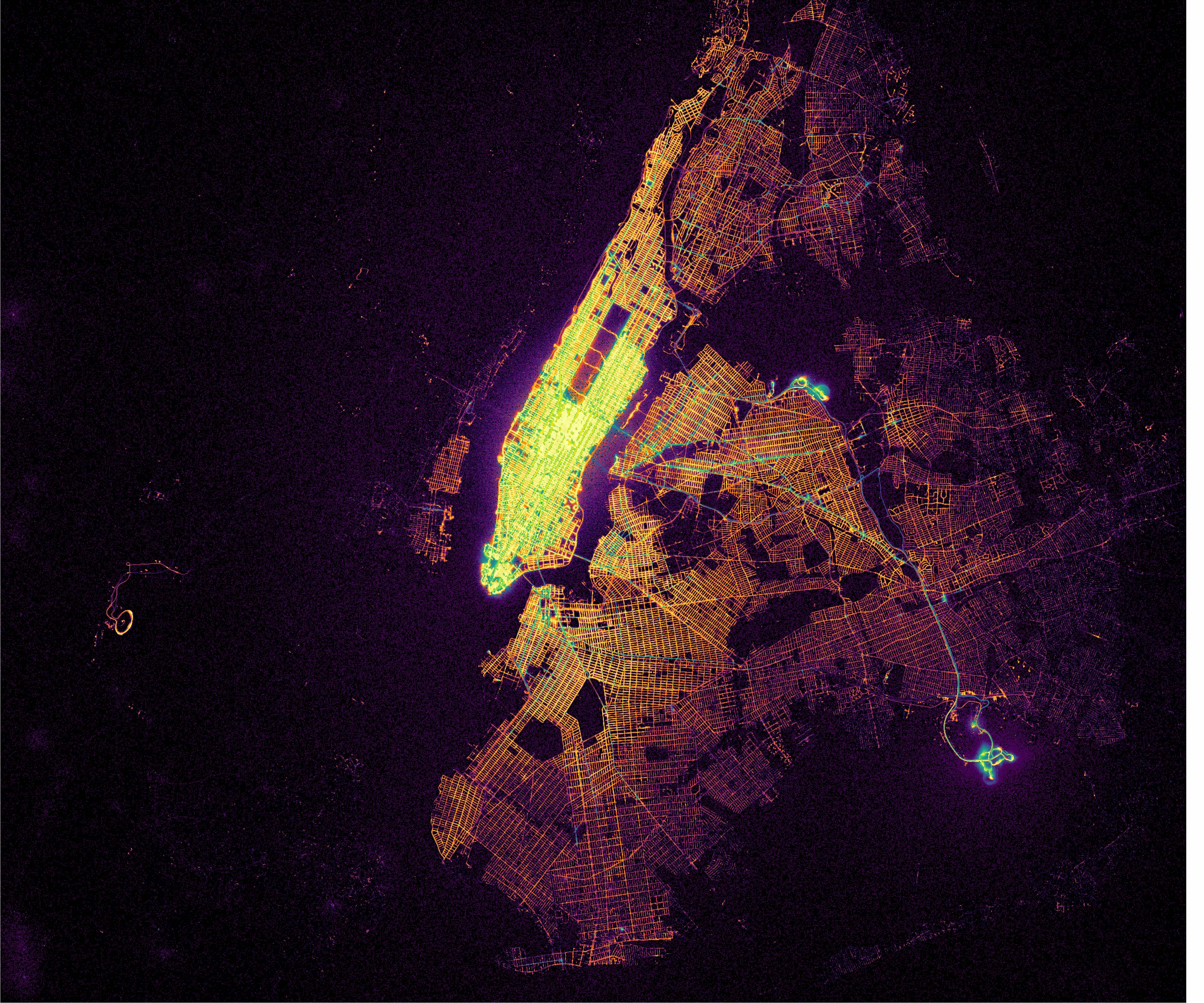 Figure 6: Pickups (Yellow-Green) and Dropoffs (Orange) for NYC Metro Area Click for full resolution
Zooming out to the broader area, there are a few major streets in Brooklyn and Queens that are green, indicating significant numbers of pickups on those streets, while the other streets remain orange, showing dropoffs from the trips that started in Manhattan dominate. At JFK and La Guardia, the pickup and dropoff areas within the airport are highlighted, with portions shaded in green (pickups), and other portions shaded in orange (dropoffs).
What about GPS?
Plotting taxi pickup and dropoff locations using Datashader and Bokeh has shown that sometimes GPS coordinate data is quite inaccurate, indicating pickup and dropoff locations in the East or Hudson rivers. We see from the maps of pickups and dropoffs in Manhattan that GPS is strongly affected by tall buildings. Dropoffs in particular show a surprisingly even distribution across the outer boroughs, and every road, and every bridge is highlighted. I find this surprising, as I would not expect many dropoffs to be occurring on the bridges, or in other locations where stopping and letting someone out of the taxi is discouraged, such as the Van Wyck Expressway, which leads to JFK. Yet, such bridges and roads are highlighted, and that makes me wonder if this a quirk of GPS? This is all speculation on my part, but what if GPS devices only update at a fixed interval, such as every two minutes, or whenever it can get a position lock? In that case, a taxi trip would end in a reasonable location, but the data would be recorded as the trip ending somewhere along the route. This would explain how large numbers of pickups and dropoffs occur in seemingly improbable locations.
Given the dataset goes back to 2009, and GPS receivers in smartphones have come a very long way since then, I am very curious if it is possible to see improvements in GPS accuracy in the taxi dataset. As a proxy for GPS error, I examined the number of pickup and dropoff locations that are in physically impossible locations, such as in the middle of the Hudson and East rivers. I then plotted the fraction of such impossible trips as a rate of the number of the total trips. Given the uptick in ride-hailing and ride-sharing services like Uber and Lyft, a rate adjustment is necessary.
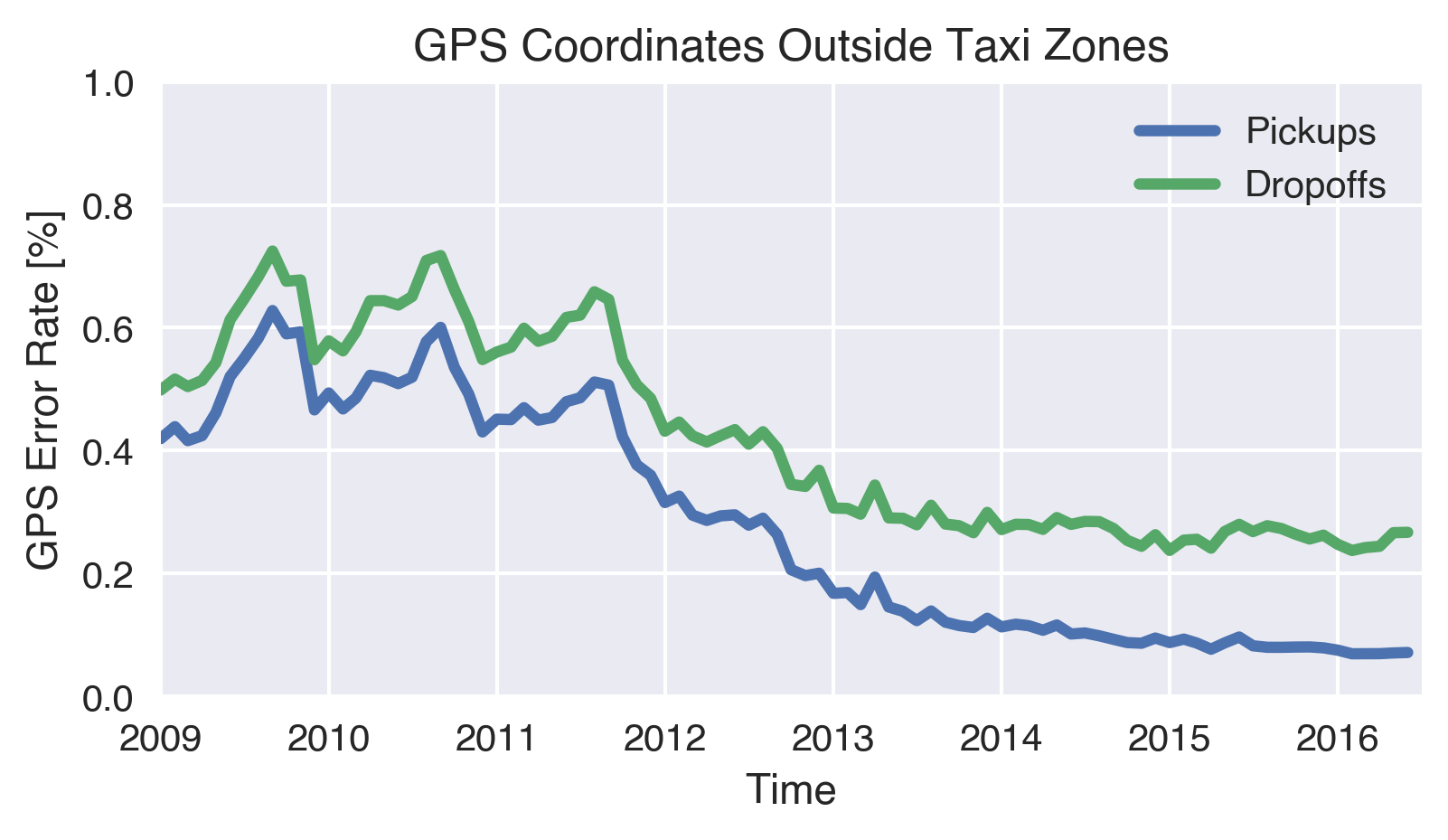 Figure 7: Rate of Pickups and Dropoffs outside of the Taxi Zones, but within the local NYC area
Sure enough, the rate of pickups and dropoffs in impossible locations has fallen by a factor of 4 to 5 since 2009. It is unclear to me what could be causing an annual cycle in 2009-2012, where the error rate increases during summer months. Since 2011, the error rate has been falling substantially, possibly due to a changeover in taxi meters across the taxi fleet, or changes in how the GPS gets reported. The fact that dropoffs are higher than pickups suggest to me that there is probably some support for my theory that GPS devices only update at a fixed interval or whenever they can get a lock on position.
It is worth mentioning that this error rate of 0.5% - 0.1% representing is not necessarily representative of actual GPS errors in particular locations. For example, the fuzzy streets in Midtown south of Central Park indicate that position error is much higher there than 0.5%. Also, GPS position can be wrong in a way that does not put it over the water, but over an incorrect land location, which would not be detected by my crude proxy for GPS error.
Summary
I obtained, cleaned, and plotted the NYC taxi dataset. I produced some interesting visualizations of pickup and dropoff locations that show the majority of pickups and dropoffs occur within Manhattan and the JFK and La Guardia airports, however there are a substantial number of taxi trips from Manhattan to the Brooklyn and Queens. Far fewer trips start in the outer boroughs and end in Manhattan. I compared the pickups and and dropoffs on a point by point basis, showing how the avenues in Manhattan have more taxi pickups than the cross streets, which have more dropoffs.
I also showed how the GPS locations have questionable accuracy. In Midtown, this is visible by 'fuzzy' streets, and a fair number of points that show pickups in impossible locations like the Hudson or East rivers. There are also an awful lot of pickups and dropoffs in locations where it would be inconvenient to drop off a passenger such as the Van Wyck Expressway, suggesting that the clear definition of such streets on the dropoffs map is a quirk of GPS devices updating infrequently. Analyzing the number of pickup and dropoff locations that happen to be in water show a significant 4-5X decrease since 2009, which might be attributable to improvements in GPS technology in taxi meters. Nevertheless, the error in the GPS locations suggest they should be considered with a grain of salt.
I will be publishing more data analyses on this dataset over the coming weeks.
Data Availability
I make the code available in my NYC-transport github repository. You can view the notebook used to make plots for this post on Github or NBViewer.
I have put the original parquet format dataframe containing the taxi data and Uber data (not the subject of this post) on Amazon S3 in a requester pays bucket. If you start an EC2 instance in the US-East zone with a properly configured s3cmd, you can copy the files as follows. Be sure to be in the US-East zone, otherwise you may incur significant bandwidth charges .
s3cmd sync --requester-pays s3://transit-project/parquet/all_trips_spark.parquet .
The data is approximately 33GB in Snappy compressed, columnar, parquet format. If reading with Dask, using the PyArrow backend is required.
This content is also posted on Medium. Please leave any comments on my medium post.